Tuesday, June 8, 2010

Self Potratz.

Transparent - I took a still picture of the background and another with me in the left hand corner, i used just the opacity and turned it down to around 60% giving teh efffect i am transparent.
I took this because i didn't just want pictures of myself, i wanted pictures that have a message. and this one would be that i am transparent.
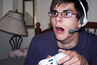
G4M3R! - This picture was the original. I didn't do any effects to it whatsoever. I sat down with derek's xbox 360 controller and headset and took the photo. not much to say about it except i'm a gamer. I play video games almost an hour everyday


This picture i cropped down to take out majority of the pool. This picture is me curling 52.5 pounds. I wanted to show that i like to workout and do everyday. I didn't touch the contrast because when i did it made my farmers tan more apparent.

Wednesday, June 2, 2010

An Undead Fastcar!
This picture was suppose to represent a song called "Fast Car" by Tracy Chapman. I captured this by taking a picture of my car. I tried to get me in a field, but it was too hard to capture it while i was moving, since i was using a tripod / timer. The effects i used for this picture was the lomo tutorial which played around with the levels adjustments and curves adjustments, along with sharpening.

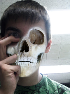
This picture was suppose to represent a song by hollywood undead called "Undead". I did this by following a photoshop tutorial on how to appear "undead". I lowered the saturation at the end to make it more undead. i had to also lower the contrast because it was hard to see my face with the lights above me.

Monday, May 24, 2010

Shotsnap

I Heart Lou Ferigno
So i took this photo of Lei Powercleaning and I used a picture of Lou Ferigno or the original incredible hulk as my shadow. I thought this was more of a funny effect and that's what i wanted to go for.


Shiva Sean.


Ricky & sean, posed for me and I photoshopped it up to make it look more old. I originally liked the idea of the shiva, but it didn't look right without the effect. The more orange color made it more shiva like.


Friday, May 14, 2010

Scream-Insanity

This photo is Zoe in a straight Jacket. It was suppose to represent or illustrate the story of the women trapped with the yellow wallpaper, I photoshoped the wall to make it appear more yellow, dimed down the contrast and upped the brightness. I messed up zoe's hair to show that she's going insane in the membrane.

ICUP Funny Colors

I used this picture for two reasons. The color is white, and it represents peace and purity. I also used this photo because the budist monk or whatever he is, represents purity also. I played around with the colors, and used a easy blur effect.
I chose this picture for green. Green represents nature and life, and overall energy. I really wanted to stay away from just plants, so as soon as i saw this guy, i knew what my picture was going to be. I blurred the background to make the forground standout.
Zoe was my Model, I used blue because it represents a calm mood. I blured out the background as best as i could so it didn't grab your attention over zoe and the blue object hanging. I like this picture because of intensity of the blue.
The color I chose was black. Black represents power and authority, I used a low shot to give me a better sense of Authority, The photoshop effects i used here were just Color balance, I darkened the sky from blue to make it more grey to give more sese of black.


Friday, May 7, 2010


I chose this photo for attractive, because in my eyes, cows aren't very attractive animals. I tried to make this more vibrant to make the focal point the cow, rather than the background. With the pictures I took I wanted the pictures to relate to one another, so this is somewhat my before picture, and the one below is the after.

I chose this for repulsive because of this is sorta the "after" of the cow. The cow is now repulsive when it's sitting on two buns. This burger from mcdonalds is exactly how i bought it, i did nothing to make it look more disgusting. I didn't apply any filters to the photo, just changed the lighting a bit

I chose this photo for attractive, because in my mind skating isn't an attractive thing, people frown upon skaters still and I just wanted to incorporate the before and after photos here too. I did an overlay and a screen to make the photo pop.

This is the after effects of skating, I have scars on my elbows from when i've fallen, but i emphasized them by using the paintbrush and burn tool

Tuesday, May 4, 2010

Filter Effects!


On these pictures I applied some filters to enhance the quality of the photo. I beleive these photographs are enhanced by the filters giving them an extra sence of depth. I like the way the gausian blurs turned out, but some of the other effects aren't as useful.